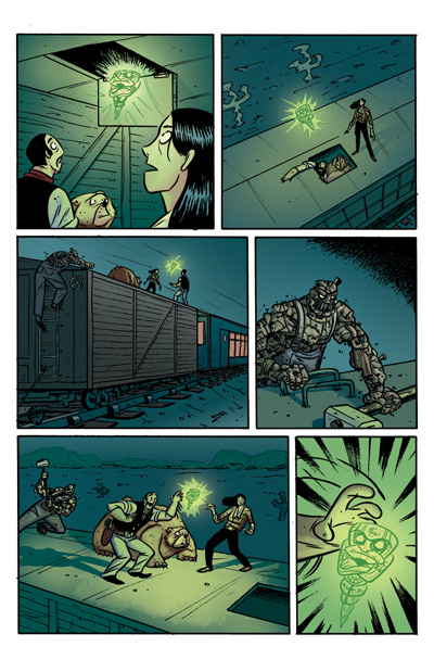
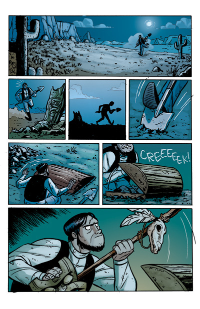
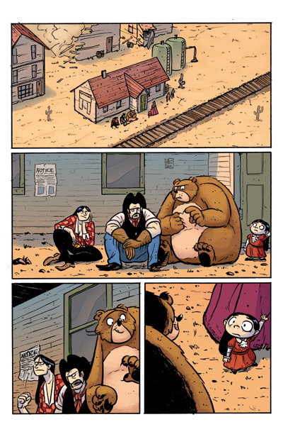
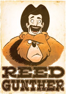
Starting with REED GUNTHER #3, Chris hands over the coloring reins to Ciaran Lucas, a talented colorist from Athboy, County Meath in Ireland, a town which is “known for it’s milk, apparently”.
I asked Ciaran a few questions about coloring for REED GUNTHER:
SHANE: Who the heck are you and what do you do on REED GUNTHER?
CIARAN: My name is Ciaran Lucas and when the fates deem me worthy I colour on Reed Gunther.
SHANE: How did you decide to get into coloring for comic books?
CIARAN: I started off in animation, and after college I floofed about in Photoshop. A lot. A friend of mine named Brian Hess liked my paintwork and asked if I’d like to colour an issue of Vincent Price Presents. Cartoon Skunks, horror, an honest-to-God comic book? Sign me up. A load of other strange and unusual things happened after that, but essentially- someone asked me to.
SHANE: What’s your process for coloring a page of REED GUNTHER?
CIARAN:Well, step one is the fun part- read the comic/script start to finish. I tend to have a feel in mind when I look through the pages, so after that it’s just a case of matching it up to what’s in my head.
Pretty early on the guys did me the BEST FAVOUR IMAGINABLE and got my pages flatted for me, which made everything so much more dynamic. I’d change most to all of the colours, focusing on getting key panels looking right and then timing the other panels as transitions between them.
Then I’d work back in to each panel and add more depth and rendering, and finish up by sorting out line holds and extra effects loveliness.
SHANE: How does color assist in telling a story in a comic book?
CIARAN: Oh no, you asked THAT question. I might go all serious for a second, just to warn you.
I’m learning more about this every day, but where I’m at now I see it working in 3 ways.
1- It helps set the mood/tone. It’s a film example, but go with me on this; Remember the scene in the Lion King where Mufasa dies? Keep an eye on the colour. That whole sequence is really rich and red. The following scene, where Simba comes out it’s a lot more grey and subdued.
Likewise, the palettes I used in RG were deliberately dusty looking, to hammer home the Old West setting. Within that, the keys were set in a way to compliment what the story was portraying- although most of the time if you’re doing your job right, nobody will notice.
2- A large part of effective colour use is telling the eye where to go. Chris nails this in the inks alone, so sometimes it’s like adding a big LOOK HERE sign. But yeah, it’s assisting with what the inks are conveying, and not trying to distract from it.
3- Adds depth- Colouring lets you render in more nuance than ink alone and that can really add a lot to a page. The main risk here is not overpowering the inks, and adding where it’d help. Essentially, making a good thing better.
SHANE: Who is your favorite REED GUNTHER character?
CIARAN: Sterling. He’s a really interesting character, a gorgeous design and without the ability to talk, heavily dependent on acting alone to sell what he’s supposed to be doing. I want one of those Sterling toys.
SHANE: Who is your favorite REED GUNTHER creator? Shane or Chris?
CIARAN: You should wrestle to decide. Let me know who wins. Chris, I’m looking at you.
